Client: PARAMEAT, Cheongju, Chungcheongbuk Province, South Korea
Brand Design

Shenzhen Symphony Children’s Choir

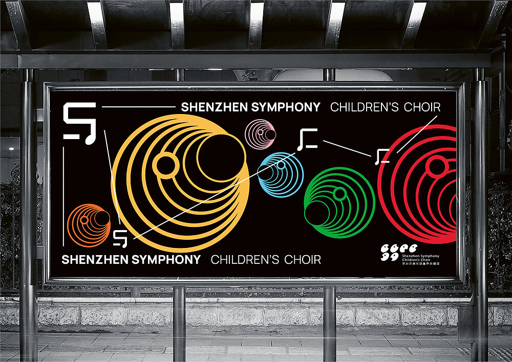
The brand design of the Shenzhen Symphony Children’s Choir combines concise graphics with colourful effects to create a visual identity that the target group can easily relate to. The logo comprises six symbols, which allude to singing children as well as musical notes. The position of the mouths represents the three different vocal registers in the choir: high, middle and low. The supporting graphic system is derived from sound waves, while the rich colours express the children’s lively temperament. Sound waves in six different sizes and in different colours are superimposed on each other, symbolising the intertwined beauty of different voices singing together.

Credits
-
Client:Shenzhen Symphony Children’s Choir, Shenzhen, China
-
Design:Shenzhen Zdesign Co., Ltd., Shenzhen, China
-
Project Team:Jiong Li (Art Direction) Ali Wang (Graphic Design) Mingjie Chen (Graphic Design) E Lin (Music Design)