Client: Microsoft, Redmond, USA
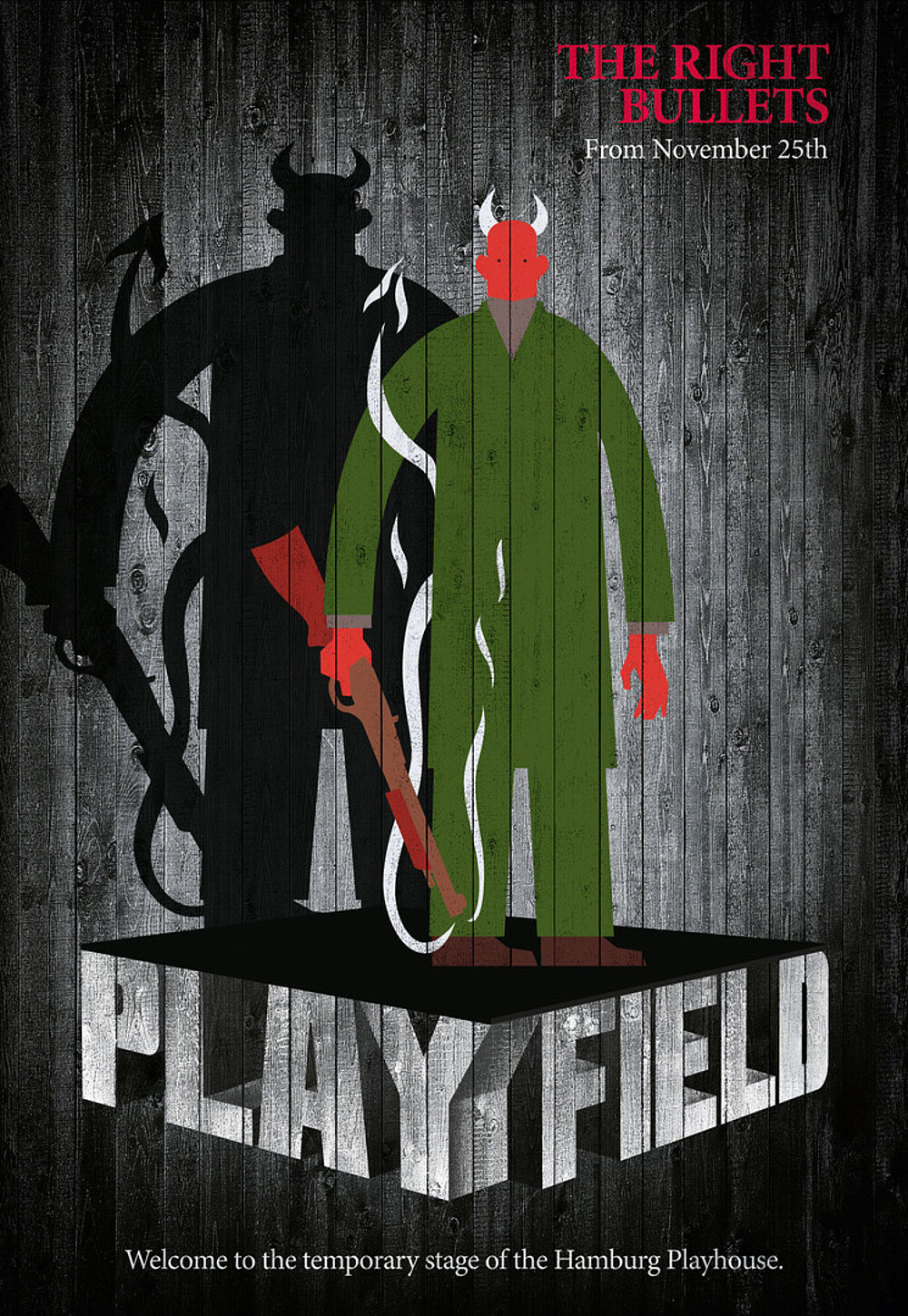
Playfield

Statement by the Jury
Great about this ad campaign is that the name of the stage itself was used and turned into a highly recognisable logo. Using a woodgrain effect as the basis of the design is outstanding, as the stage was meant to be only temporary. In contrast to this stand the colourful bold motifs used to symbolise the very nature of each play and complement the content of all promotional materials, turning them into real eye-catchers.

-
Client:Deutsches Schauspielhaus, Hamburg
-
Design:thjnk ag, Hamburg
-
Chief Creative Officer:Armin Jochum
-
Creative Direction:Patricia Wetzel, Patricia Pätzold
-
Art Direction:Juliane Lange
-
Illustration:Aad Goudappel, Rotterdam