Brand Design

OKKO

Back Download

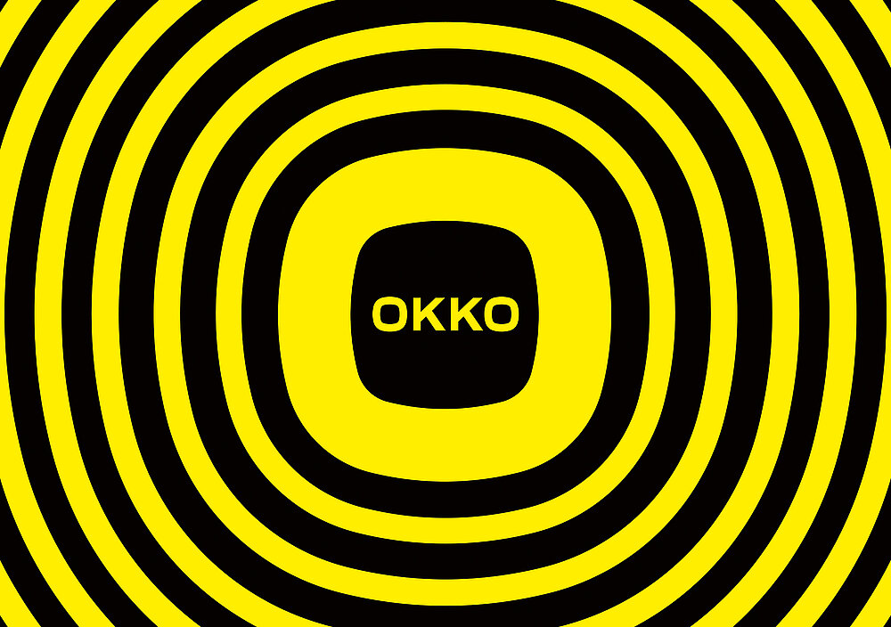
OKKO, a major Ukrainian network of petrol stations, claims that “great ideas come in motion”. The company not only provides petrol to energise cars and products to clean cars, but also tasty food and drinks in a refreshing atmosphere to “continue moving”. The visual style of the company’s new branding is based on the claim “OKKO. Always a good idea” inspiring the exclamation “O!”, which is often used by people when a good idea just came to their mind. Turning this “O!” into a radial pattern has lent the brand a unique visual language. The pattern expands outwardly, almost like waves forming on a water surface after throwing a stone into it, to communicate a dynamic and hypnotic notion associated with the brand. The pattern starts from the products according to the motto that “ideas are more likely to come after a tasty meal or a bracing coffee”. Complemented by clear, bold letters, the logo is immediately recognisable by its characteristic shape, both with and without rings, and clearly stands out in all variations, each a combination of black with one distinctive and vibrant colour.

Statement by the Jury

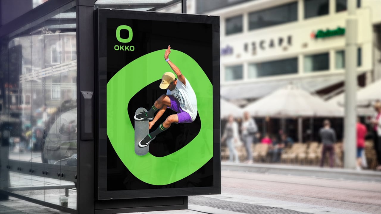
The new visuals for the brand OKKO exude a very powerful and energetic presence. The bold and strong logo uses black as a main carrier of the message symbolising petrol and oil, paired with highly vibrant colours distinguishing the individual products. The entire appearance truly complements the brand values and has emerged as a playful and versatile corporate visual platform that appeals to different audiences – a splendid example of design work.
Red Dot: Grand Prix

By starting the video, you agree that data, e.g. your IP address, will be sent to Vimeo. vimeo.com/privacy

Others interested too