Client: Vinska hiša Bjana, Dobrovo v Brdih, Slovenia
Cosmetics Packaging

Milk Baobab

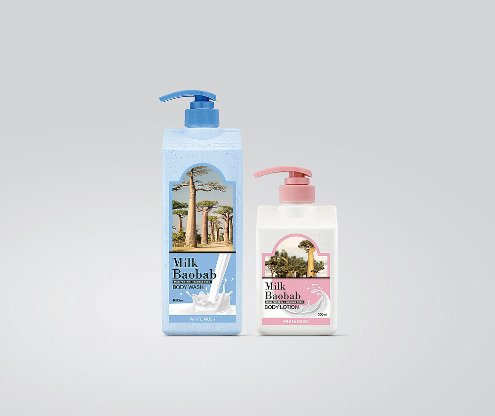
The packaging design of these hair and body care products is, on the one hand, inspired by milk and, on the other, by the baobab tree, thus hinting at two characteristic ingredients used in all of the products. The containers are in the shape of milk cartons, with gently rounded edges to prevent injury and with subtle dots of carbon in the printing. The labels feature powerful imagery, allowing the ingredients to be intuitively recognised. In order to make sure the different products can also be distinguished easily, the containers are of different colours.

Credits
-
Client:Taenam Household & Healthcare Ltd., Seoul, South Korea
-
Design:Taenam Household & Healthcare Ltd., Seoul, South Korea
-
Project Team:Yuna Nam (Designer) Jeongung Lee (Designer) Hyein Kim (Designer) Hyunji Park (Designer) Jihyun Joo (Designer)