Client: Caobu Economic Cooperative, Zhongshan City, Guangdong Province, China
Poster

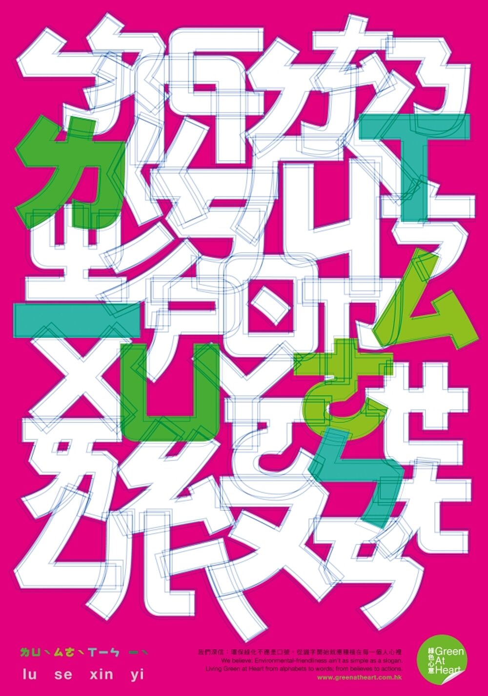
Mandarin Phonetic Symbols (Series)

The efforts and activities of the green economy industry have depended, since its beginnings, on innovative and broadly conceived advertisement methods, which convey to as many people as possible the different approaches and projects, the idea of a corporate management and the concept of peace. This poster series features an exclusively typographic design and aims to educate the next generation on how to develop a green environmental awareness as early as possible, and to give them a better understanding of fair trade and organic food. Thus, the posters are inspired by and pick up on the first thing taught in school: the alphabet. Through the phonetic symbols of Mandarin and the characters of the Latin alphabet, between which the name of the company is hidden, the campaign aims to convey that the concept of environmental protection and, thus, the concept of the Green at Heart company has become a natural and essential part of human life.
Statement by the jury
»The meaning of this mysterious poster series lies hidden in a footnote: ‘We believe: Environmental friendliness is the universal language. Education leads us to live Green at Heart.’ The cryptic, typographic message of the different alphabets underlines this universal demand with a poetic appeal. Realised as ‘concrete poetry’, the design possesses a quality that is as self-sufficient as it is surprising.«

Credits
-
Client:Green at Heart, Hong Kong
-
Design:Hufax arts
-
creative direction/art direction:Fa-Hsiang Hu
-
concept/text:Alain Hu
-
graphic design:Fa-Hsiang Hu, Fei Hu, Di Hu
-
account management:Kai-I Lee