Client: PARAMEAT, Cheongju, Chungcheongbuk Province, South Korea
Brand Design

Friends of the Ruin

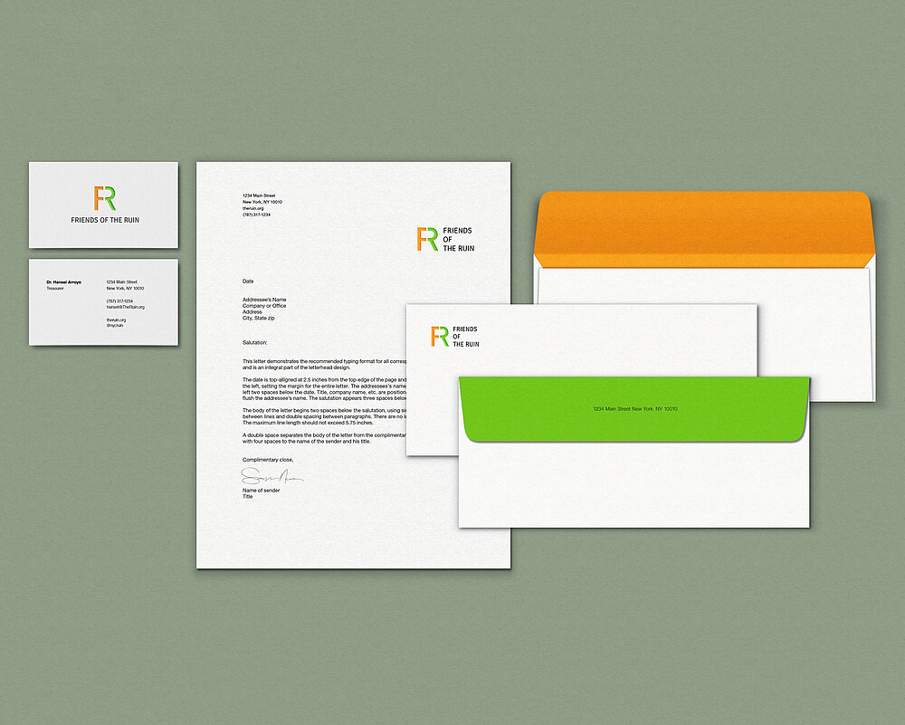
Neglected for decades, a former smallpox hospital stands on Roosevelt Island in New York. The non-profit organisation Friends of the Ruin aims to spark the public’s interest in the historical site and to revive the ruin. The brand design for the organisation focuses on the effect of two bright colours and typography. The logo is a combination of the initials F and R to form the letter R as a whole. Thus, the message is conveyed that the remains of the site should be transformed into one harmonious public space. Just like the ruin, the letters are incomplete and unstable, yet they support each other and create a solid and memorable shape.

Credits
-
Client:Friends of the Ruin, New York, USA
-
University:School of Visual Arts, New York, USA
-
Design:Jieun Lee, School of Visual Arts