Client: PARAMEAT, Cheongju, Chungcheongbuk Province, South Korea
Brand Design,Brand Identity

cociety

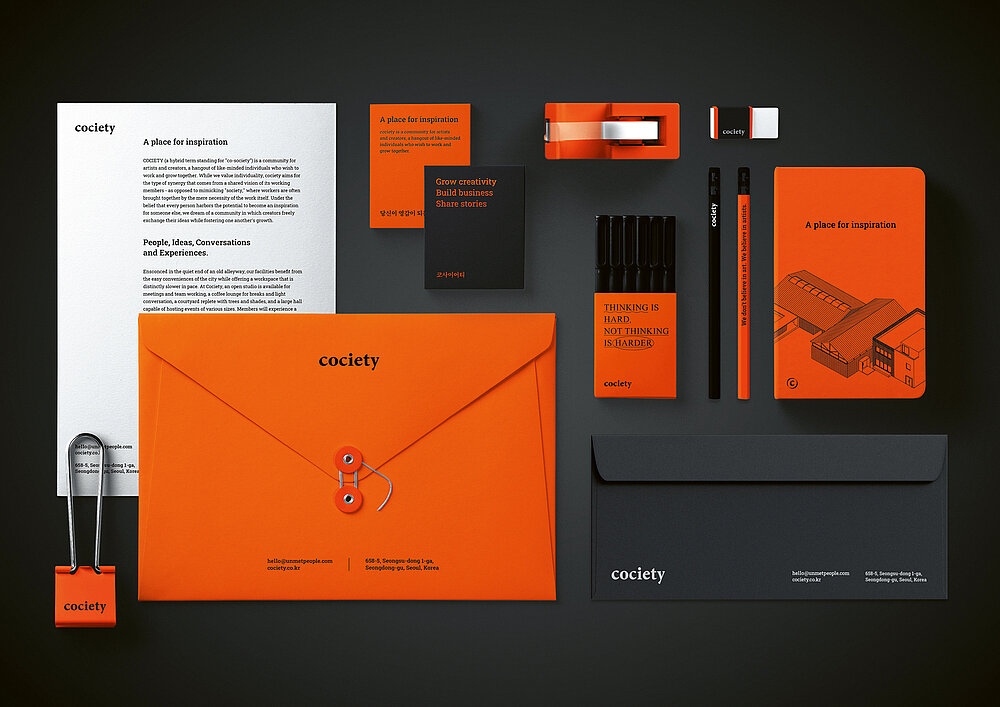
cociety is a platform for creators to support their business and design projects. The brand name stands for “co-society” and communicates the idea of a community of like-minded designers who grow through mutual exchange. Based on this concept, the brand identity is revealed by the distinctive word mark in a lowercase serif typeface with delicate details. Representing inspiration and ambition, the bold orange colour creates a strong contrast to the typography and key visuals. The brand design has been consistently implemented, from brand stationery to the welcome kit for new members.

Credits
-
Client:cociety, Seoul, South Korea
-
Design:UMP, Seoul, South Korea
-
Project Team:Taeyang Wui (Creative Direction) Hyuna Lee (Graphic Design) Siuk Kang (Graphic Design) Arang Lee (Graphic Design)