Client: Moody's Corporation, New York, USA
Corporate Design

Chunmi

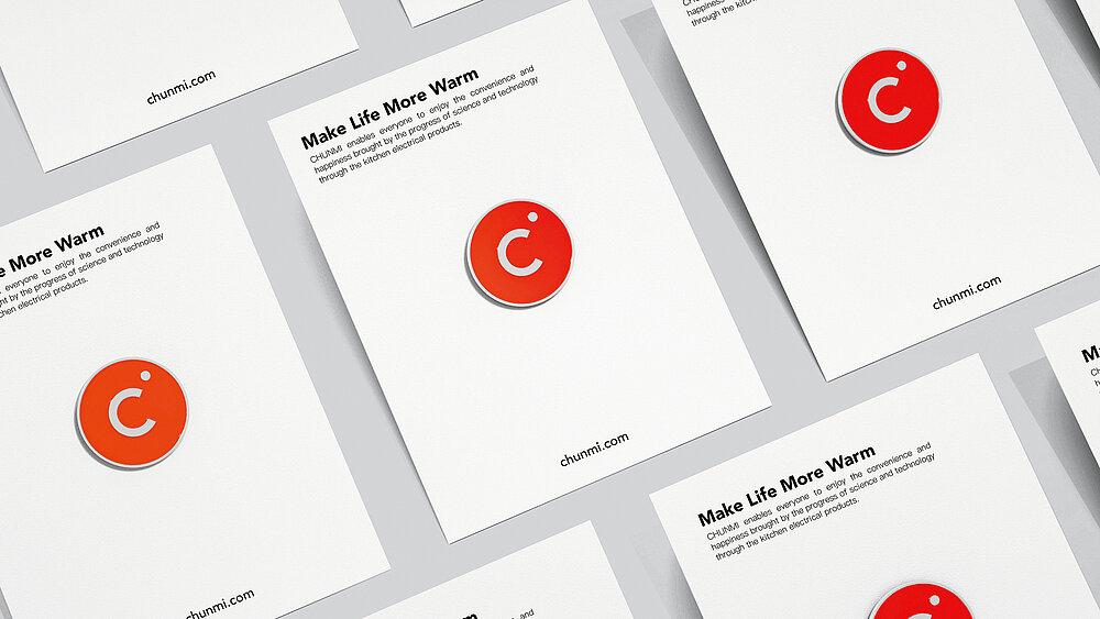
As a kitchen appliance manufacturer, Chunmi aims to address a young, lifestyle-oriented target group and to position its products in the context of consumption upgrade. The entire corporate design centres on a round, orange logo, whose warm colour symbolises the warmth felt when cooking, while the signal effect allows for far-reaching visibility. In addition, the initial “C” is a versatile design element that stands for the innovative potential of the company. The claim is underlined by the homogeneous colour palette, which achieves a high level of recognition both in the interior design and in external communication.

Credits
-
Client:Shanghai Chunmi Electronic Technology Co., Ltd., Shanghai, China
-
Design:Shanghai Chunmi Electronic Technology Co., Ltd., Shanghai, China
-
Project Team:Liyuanxun Chen (Creative Direction) Xulei Peng (Motion Design) Huixin Ding (Web Design)