Client: PARAMEAT, Cheongju, Chungcheongbuk Province, South Korea
Visual Identity,Brand Design Relaunch

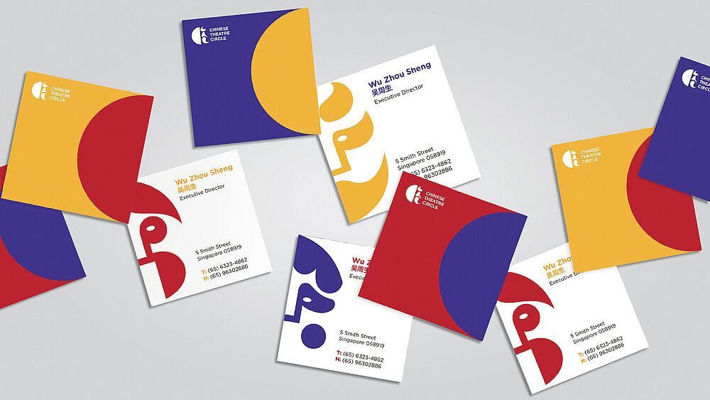
Chinese Theatre Circle

This rebranding project focuses on attracting a younger generation by positioning the Chinese Theatre Circle as a cultural movement that is contemporary and progressive. The brand logo represents a character that is half hidden, half revealed behind an abstract theatre mask, an effect that is achieved by using a half circle on one side and a series of changing faces on the reverse side, which is implemented across all of their communications. The use of contrasting colours was inspired by the typical makeup and attire worn during performances and enhances the appeal of the visual identity.

Credits
-
University:LASALLE College of the Arts, Singapore
-
Design:Aileen Aurelia, LASALLE College of the Arts