Client: Vinska hiša Bjana, Dobrovo v Brdih, Slovenia
Beverage Packaging

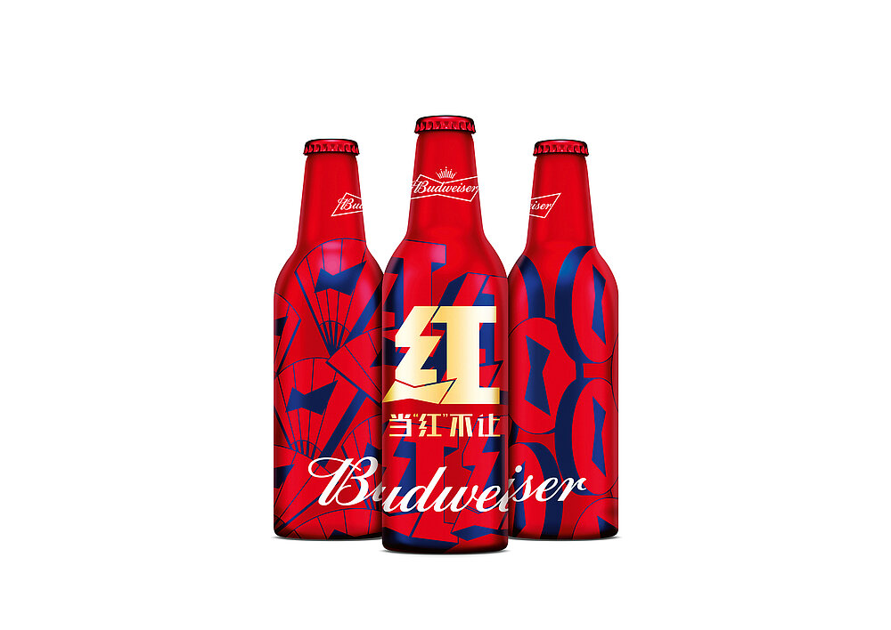
Budweiser Chinese New Year 2020 | Budweiser Red

Red is the colour of the traditional celebration of the Chinese New Year. In order to distinguish itself from other brands which also link their communication to this colour during that period, the design of the limited edition of Budweiser beer uses a new red sign. It is based on the famous brand logo, in the form of a bow tie, and is used together with Chinese New Year greetings which contain the word “red”. The festive packaging design also shows a modern version of traditional icons, accentuated with the blue colour typically used by the brand. This creates a vibrant and unmistakeable look.

Credits
-
Client:Anheuser-Busch InBev (China) Sales Company Limited, Wuhan, China
-
Design:Jones Knowles Ritchie, Shanghai, China
-
Project Team:René Chen (Managing Director Creation) Yolanda Tang (Managing Director Creation) Woei Yang Fang (Creative Direction) Vivian Xie (Graphic Design) Wendy Yang (Graphic Design) Theresa Wu (Account Management) Hermia Fung (Account Management) Angel Tang (Account Management)