Client: PARAMEAT, Cheongju, Chungcheongbuk Province, South Korea
Brand Design,Visual Identity

Between Contrasts

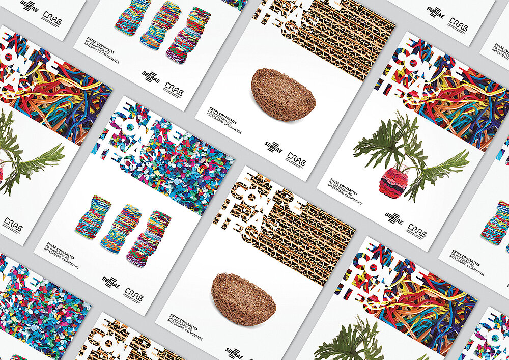
The Entre Contrastes (Between Contrasts) exhibition featured handicrafts made of waste from the textile and paper industry in Brazil. The logo played on the contrasts between the different exhibits, the words being formed through an effect of presence and absence of letters. Black and white stand in contrast to the abundance of colours visible in the handicrafts. The chosen brand design solutions reduced waste at the end of the event. By bringing up concepts such as creative reuse, the exhibition appealed to visitors to reflect on consumption and its consequences for the environment and future generations.

Credits
-
Client:Sebrae / SC, Florianópolis, Brazil
-
Design:Yepá Estúdio, Florianópolis, Brazil
-
Project Team:Carolina Dentice (Creative Direction) Luana Dentice (Creative Direction) Cristiane Amaral (Graphic Design) Priscyla Falkenburger (Graphic Design)