Client: PARAMEAT, Cheongju, Chungcheongbuk Province, South Korea
Brand Design

Bakehouse

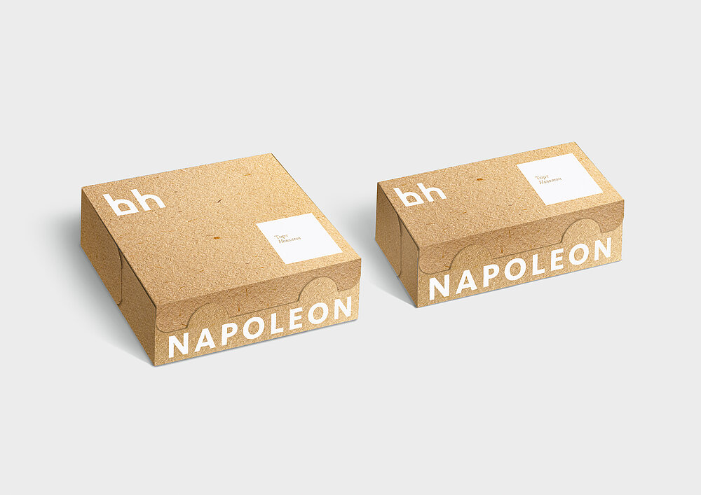
The certified organic bakery Bakehouse sets high standards for the quality of its products. Therefore, its brand design required the same reverent attitude to detail. The minimalist logo comprises two letters, the initials of the company name, which are rendered graphically to look like the contours of a traditional stonewalled oven. The initials are framed by the circular-shaped word mark. In addition, on the packaging the word mark is also set horizontally in capital letters against a light background. The brand design is puristic with its black and white colours, amplifying the contrast of the visual effect of the partly coloured bakery products.

Credits
-
Client:Good Wine, Kyiv, Ukraine
-
Design:banda.agency, Kyiv, Ukraine
-
Head of Marketing:Mariya Oleynik Good Wine
-
Creative Direction:Pavlo Vrzhesch banda.agency
-
Art Direction:Yegor Petrov Anton Kolotylo banda.agency
-
Account Management:Zhenia Dvoretska banda.agency