Client: Vinska hiša Bjana, Dobrovo v Brdih, Slovenia
Packaging

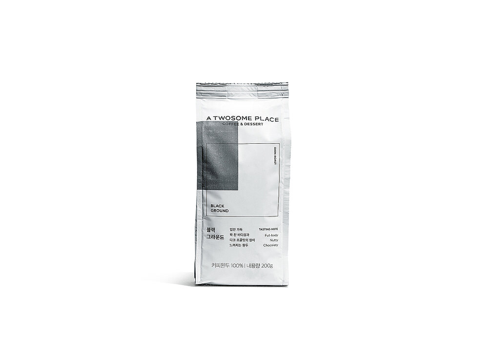
A TWOSOME PLACE

This coffee bean packaging has been created with the aim of meeting the principles of distinctiveness and consistency. Starting from a square at the centre of the bag, the graphics are based on an imaginary coordinate system. The horizontal axis shows the acidity of the coffee inside, while the vertical axis presents the degree of roasting. A striking colourblock square denotes the flavour. Thus, the geometrical design language characterises the brand, communicates the product’s features in a transparent way and provides a variable packaging layout for the coffee range.

Credits
-
Client:A TWOSOME PLACE, Seoul, South Korea
-
Design:A TWOSOME PLACE Design Team Seoul, South Korea CFC, Seoul, South Korea