Client: web3lex SCHERENBERG LEGAL & LICENSING, Hamburg, Germany
Relaunch

Hapag-Lloyd Cruises

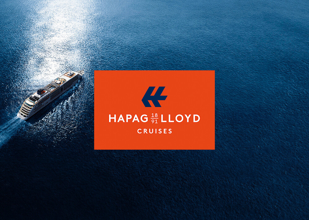
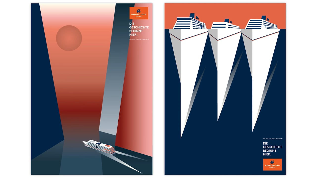
Cruise operator Hapag-Lloyd Kreuzfahrten used the 125-year anniversary of its cruises to change its name and redesign its appearance in the cruise segment. “Hapag-Lloyd Kreuzfahrten” was changed to “Hapag-Lloyd Cruises”, not only to create a tangible separation between the luxury cruises and container shipping segments, and to no longer have them sail under the same flag and brand logo. This also allowed lending the luxury cruise segment a more refined appearance. The new corporate design features reduction to a minimum and the new Brown corporate typeface, a finely crafted sans-serif font reminiscent of advertising graphics and the heyday of luxury cruises. Corresponding to the adapted colour code, the orange was remixed to achieve a sunset mood, making it serve no longer as a mere signal colour, and the brand colour of blue was enhanced by opting for the depth of “ocean blue”. As part of this evolutionary redesign, the icon was also modernised and the founding year, 1891, was integrated in order to strengthen the company’s market position in this premium segment.
评审团评语
The redesign of Hapag-Lloyd Cruises shows the great evolution of the brand, bringing up an unseen touch of visual appearance to this segment. The simple and strong use of the colour palette, a clear typography and a contemporary execution of the old established style are truly eye-catching and not only call the attention of a younger audience to the brand but also invite them to consider taking a cruise.

参与人士
-
Art Buying:Anika Fregin
-
Art Direction:Paul Neulinger
-
Client:Hapag-Lloyd Cruises GmbH, Hamburg
-
Project Management:Stephanie Krieger
-
Graphic Design:Barbara Madl, Carolin Stiller, Simon Büßem
-
Design:MUTABOR Design GmbH, Hamburg

By starting the video, you agree that data, e.g. your IP address, will be sent to Vimeo. vimeo.com/privacy
