Exhibition Design

Fading Stories

返回 Download

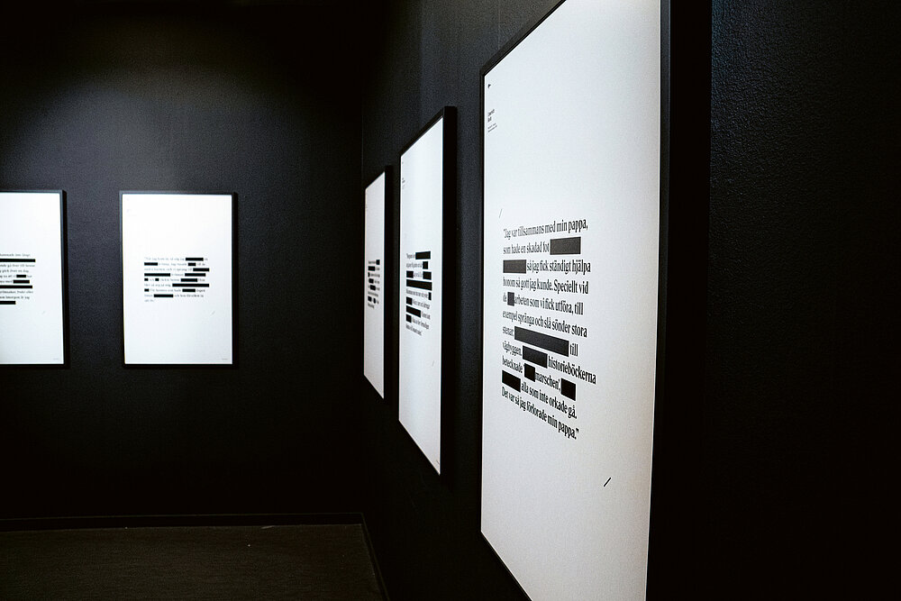
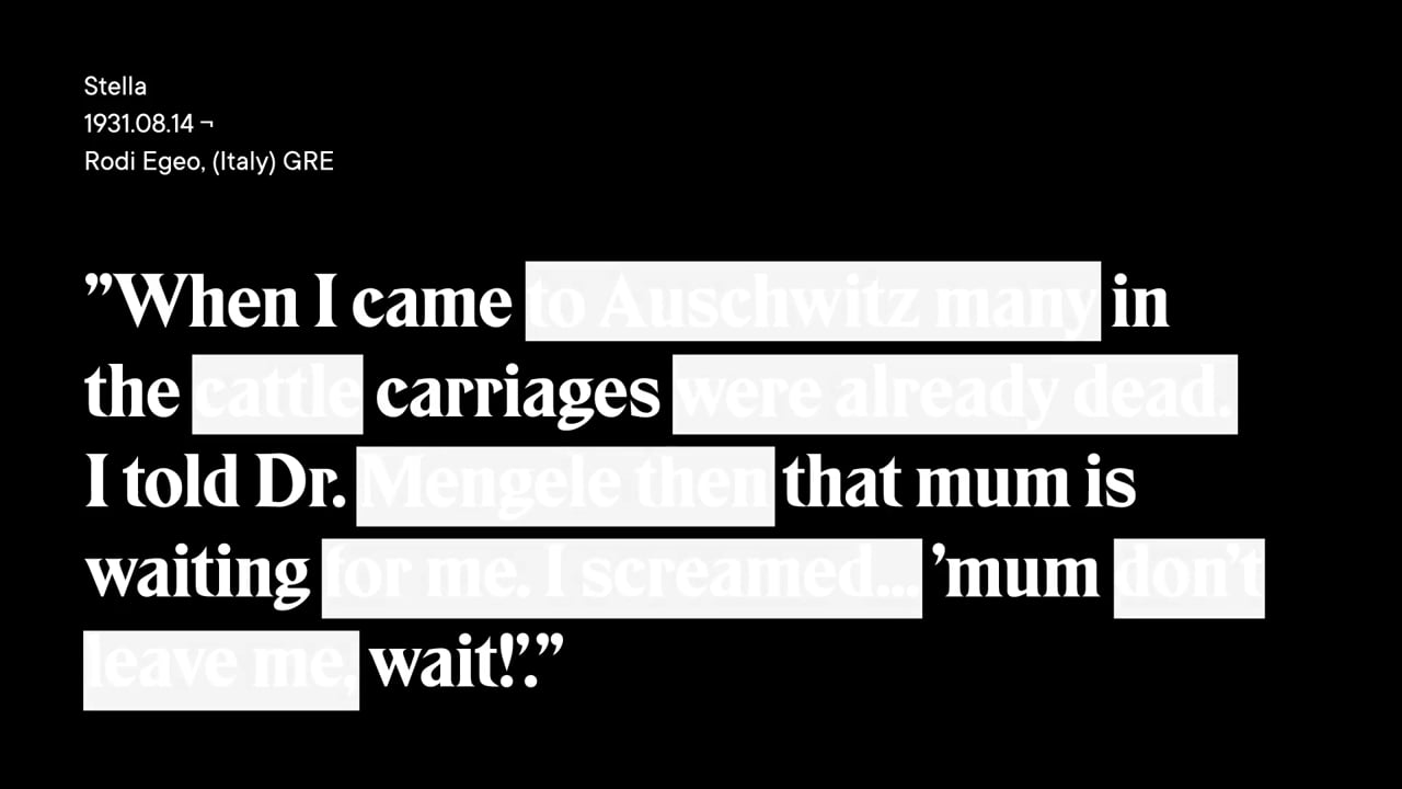
The exhibition “Fading Stories – pass them on” at Fotografiska in Stockholm portrayed 23 survivors of the Holocaust. While the presentation in the physical space was reduced to typographic posters in black and white, photographs and other background information including interviews were accessible via an AR app. Based on quotes from the survivors, the aesthetics of the poster framework were inspired by censured documents with blacked out passages, in order to illustrate how easily stories can be fragmented and corrupted. This demanded the viewers’ attention and thus urged the importance of seeing the full story, to see through “alternative facts”. Technically, the typographical set-up of the posters worked as a QR code that invited visitors to use their phone camera to unlock each portrait and, once unlocked, to be able to access the full story, the survivor’s voice and portrait at any time. The typeface on the posters had a strong visual connection to the Hebrew alphabet and thus created an additional bond between history and present.

评审团评语

The way in which the reduced black-and-white design concept of this exhibition plays with the meaning of blacked out content in the quotes from Holocaust survivors is downright outstanding. Just like active remembrance can fade away, so can text quickly become meaningless or corrupted. Featuring blacked out text as QR code effectively turns the hidden words into a key to knowledge – another clever congruence of idea and content, which communicates the topic in a shocking yet extremely successful manner.

Red Dot: Grand Prix

By starting the video, you agree that data, e.g. your IP address, will be sent to Vimeo. vimeo.com/privacy

Others interested too