University: Beijing Jiaotong University, Beijing, China
Brand Design

cafe noote

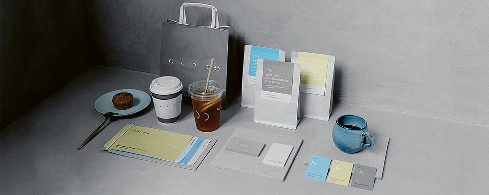
cafe noote is an indie coffee shop with a brand design that blends the minimalist character of its interior design with the emotional quality of encounters between people. Drawing upon the idea of a handwritten note, the development of the logo started with the letter “O” split into two halves to symbolise interaction and conversation. Grey is used as the main colour to create a contemporary urban look, while the bright sky blue and beige yellow add bright colour accents. In addition, handwritten messages and half circles serve as eye-catchers both in the interior design and on printed items.

参与人士
-
Client:cafe noote, New Taipei City, Taiwan
-
Design:think brand consultancy, Taipei City, Taiwan