Brochure
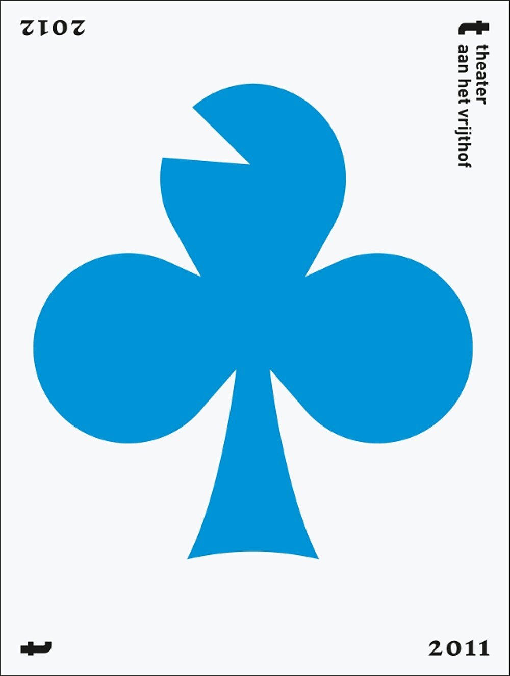
Theater aan het Vrijthof Season 2011/2012

Every year, a visual theme for all external communication is designed for the coming season at the Theater aan het Vrijthof in Maastricht. For the 2011/2012 season, this visual system plays with the symbolism of playing cards: a modified version of hearts, clubs, diamonds and spades form the basis for all promotional materials, triggering associations with the idea of “a play”. In bold colours and with a triangular notch reminiscent of a punched ticket, the motifs speak a consistent language – down-to-earth yet at a high artistic level.
크레딧
-
Client:Theater aan het Vrijthof, Maastricht head of marketing Mikos Pieters
-
Design:Zuiderlicht, Maastricht
-
graphic design:Tim Baumgarten
-
project management:Eric Uijterwaal
