Corporate Sound Concept

Rohde & Schwarz Audio Branding

뒤로 다운로드

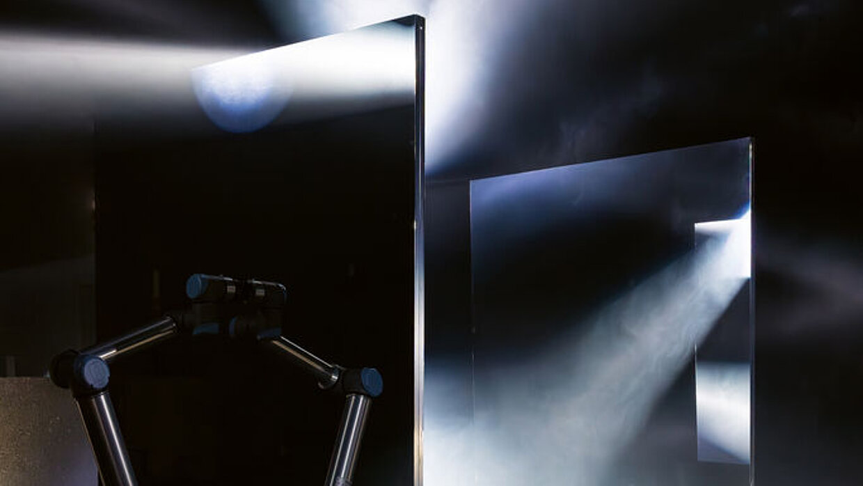
Rohde & Schwarz is an expert in the fields of electronic test equipment, broadcasting and radio communications, ensuring the smooth operation of everyday processes from airport security to wireless communications. Precision and calibration, as the core of what the company stands for, inspired the creation of the new audio branding, which also includes the visual logo. This is because both the sine wave framed by a diamond and the word mark “R/S” stand for precision; and this very sine wave formed the basis for the musical leitmotif of all R&S compositions, including the sound logo. To express this sonically, the Chladni experiment was carried out, in which grains are placed on a metal plate that vibrates with sound. The invisible sound waves then appear as shapes in the grains. The R&S sound logo was thus created at exactly 440 Hz and uses this frequency of a tuning fork pulse as a metaphor for the precise calibration process that is typical of the company’s work. To further emphasise the quality of precision, the acoustic instruments vividly depicted in the audio branding were not played by humans, but exclusively by machines.

심사평

The audio identity for Rohde & Schwarz is outstanding in its entirety and captivates with both its craftsmanship and the concept behind it. Thus, the essence of the company was first ingeniously recognised and then implemented by developing the right tools and literally the right instruments. Having machines play the acoustic instruments is an image that is highly fascinating yet unfolds its effect and uniqueness in the most subtle way.

Red Dot: Best of the Best

By starting the video, you agree that data, e.g. your IP address, will be sent to Vimeo. vimeo.com/privacy

Others interested too