Corporate Identity

Polestar

뒤로 다운로드

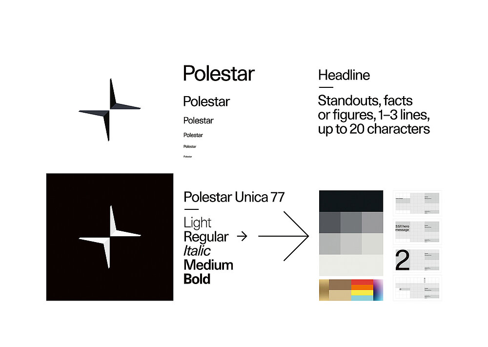
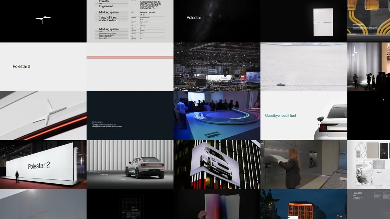
The electric car brand Polestar breaks with established conventions in the car industry. While many companies use chrome and flashes to mark their presence, Polestar highlights technological advancement and makes its products appear as works of art. With a focus on eliminating abundance even in the smallest of details, these works thus manage to deliver an unparalleled, holistic brand experience. Alongside a toolbox, the development of the corporate identity also comprised implementations for all brand touchpoints, including retail, digital, communication and printed matters. The symbol is an interpretation of the name, Polestar, the guiding northern star, which has been developed seamlessly with the cars and is intended for iconic application throughout the brand universe. The typographic marking system of reduced design serves as the backbone to highlight the performance features and information throughout the brand and its products. The monochrome approach to colour creates a touch of timeless elegance and sophistication.

심사평

In an era in which sustainability is a strategic priority for manufacturers, the Polestar automotive brand and its corporate design truly stand out. Down to the last detail, the design follows the principle of reduction to the essentials. The result is an aesthetic that impresses with minimalism and elegance. The unobtrusive typeface and the logo, which is visualised as an abstract star in the sky, merge to create an expression of high quality.

Red Dot: Best of the Best

By starting the video, you agree that data, e.g. your IP address, will be sent to Vimeo. vimeo.com/privacy

Others interested too