Client: Dot Incorporation, Seoul, South Korea
Website
Bro&Tips
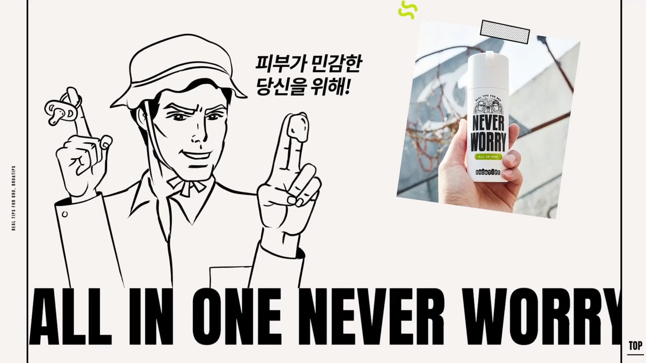
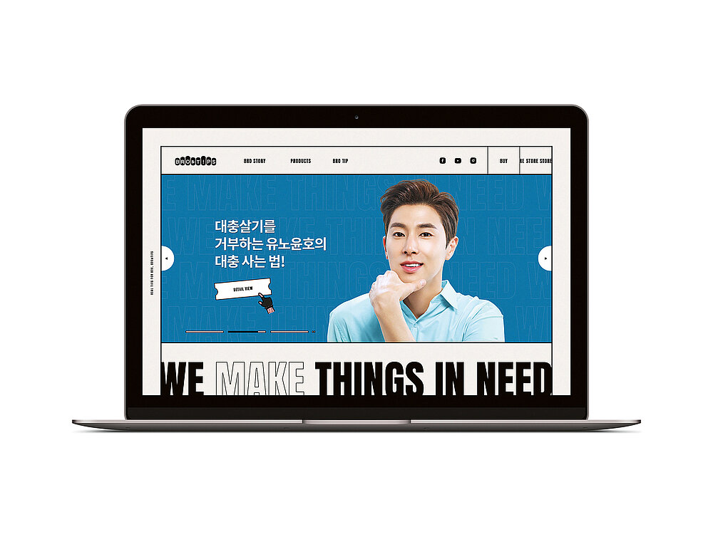
Bro&Tips is a Korean skincare range developed exclusively for men. The range caters to male consumers, who in general are not much concerned about skincare, with easy-to-use all-in-one products. The message featuring on the website reads “live a half-hearted life”, which conveys a sense of carefree coolness in a credible manner. The brand name Bro&Tips is made up of “bro” for brothers – and refers to the close, almost intimate relationship between them – and “tips” in the sense of practical advice that friends and brothers give each other. The individual products have names such as “Never Oily”, “Never Dry” or “Super Natural” for the individual skin types and are packaged in simply designed tubes featuring humorous illustrations. The website appeals to the target group of casual, trendy young men, who want to have fun, with a combination of easy-to-like cartoons, bold typography and animated illustrations, conveying information such as on ingredients and ways of application in a clear and immediately-to-find manner.
Begründung der Jury
This website for men-only skincare products impresses with its quirky approach with which it addresses the target group of the young male generation. The entire conception of how copy, imagery and – in the animations – even rhythm work together has been implemented in an unusual yet highly consistent, loud and gaudy manner. The distinctive design is simple, easy-to-recognise and highly functional.
Credits
-
Client:Amorepacific, Seoul, South Korea
-
Design:Amorepacific, Seoul, South Korea
-
Project Team:Amorepacific: Seokhoon Choi Kanghwan Jeon (Web Design) Dooyeon Kim (Art Direction) Sangwoo Shin (Photography)
Studio-JT: Seungoh Yang (Project Management) Dawon Jung (Web Design) Jisoo Lee (Web Design) Nicolas Chauvet (Programming)
Durch Starten des Videos erklären Sie sich damit einverstanden, dass Daten wie z.B. Ihre IP-Adresse an Vimeo übermittelt werden. vimeo.com/privacy